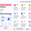
A great website is more than just attractive visuals. Even a beautiful design can frustrate users if it is difficult to navigate, slow to load, or confusing to interact with. Poor user interface (UI) decisions can lead to higher bounce rates, lower conversions, and a negative impression of your brand.
Here are some of the most common UI design mistakes that hurt user experience and how to avoid them.
1. Poor Navigation Structure
Navigation is one of the most important elements of any website. If users cannot find what they are looking for quickly, they are likely to leave.
Common Problems
- Too many menu items
- Confusing labels
- Hidden navigation options
- Lack of search functionality
Best Practice
Keep navigation simple, organized, and intuitive. Use clear labels and maintain a consistent menu structure across all pages.
2. Inconsistent Design Elements
When buttons, colors, typography, or spacing vary throughout a website, users may become confused.
Common Problems
- Different button styles
- Multiple font families
- Inconsistent icon usage
- Uneven spacing
Best Practice
Create a design system or style guide to ensure consistency throughout the website.
3. Weak Visual Hierarchy
Users should instantly understand what information is most important on a page.
Common Problems
- Everything appears the same size
- Important content is buried
- No clear focal point
Best Practice
Use font sizes, colors, spacing, and contrast to guide users through content naturally.
4. Poor Mobile Experience
With most web traffic coming from mobile devices, a desktop-only design can significantly impact usability.
Common Problems
- Small touch targets
- Text that’s difficult to read
- Elements overflowing the screen
- Slow mobile performance
Best Practice
Adopt a mobile-first approach and test designs across multiple devices and screen sizes.
5. Slow Loading Interfaces
Users expect websites to load quickly. Delays can lead to frustration and abandonment.
Common Problems
- Large images
- Unoptimized animations
- Excessive JavaScript
- Too many third-party plugins
Best Practice
Optimize images, minimize code, and focus on improving Core Web Vitals.
6. Low Contrast and Poor Readability
A visually appealing design is useless if users struggle to read the content.
Common Problems
- Light gray text on white backgrounds
- Small font sizes
- Decorative fonts for body text
Best Practice
Use accessible color contrast ratios and readable typography with sufficient spacing.
7. Too Many Popups
While popups can be effective for lead generation, excessive interruptions create a poor user experience.
Common Problems
- Immediate popups on page load
- Multiple overlapping popups
- Difficult-to-close modals
Best Practice
Show popups at appropriate moments and make them easy to dismiss.
8. Unclear Call-to-Action (CTA)
Users should know exactly what action to take next.
Common Problems
- Generic button text
- Multiple competing CTAs
- Hidden action buttons
Best Practice
Use clear and action-oriented text such as:
- Get Started
- Request a Quote
- Book a Demo
- Contact Us
9. Ignoring Accessibility
Accessibility improves usability for everyone, not just users with disabilities.
Common Problems
- Missing alt text
- Keyboard navigation issues
- Poor color contrast
- Unlabeled form fields
Best Practice
Follow WCAG accessibility guidelines and regularly test your website for accessibility compliance.
10. Overusing Animations
Animations can enhance a design, but excessive motion can distract users.
Common Problems
- Continuous moving elements
- Slow page transitions
- Excessive hover effects
Best Practice
Use animations purposefully to provide feedback and improve usability rather than decoration alone.
11. Complicated Forms
Forms are often where conversions happen. Poorly designed forms can drive users away.
Common Problems
- Too many required fields
- Confusing error messages
- Poor field organization
Best Practice
Keep forms short, provide clear labels, and display helpful validation messages.
12. Lack of White Space
Many designers try to fit too much content into a small area.
Common Problems
- Crowded layouts
- Difficult-to-scan content
- Visual clutter
Best Practice
Use generous spacing between sections, text, and interface elements to improve readability and focus.
Final Thoughts
Effective UI design is not just about making a website look modern—it’s about creating a smooth and enjoyable experience for users. By avoiding common mistakes such as poor navigation, weak visual hierarchy, slow loading times, and inconsistent design patterns, you can improve engagement, increase conversions, and build trust with your audience.
Key Takeaways
- Keep navigation simple and intuitive
- Maintain consistency throughout the interface
- Prioritize mobile responsiveness
- Improve readability and accessibility
- Use clear calls-to-action
- Optimize website performance
- Avoid clutter and unnecessary distractions
A user-friendly interface helps visitors achieve their goals quickly, leading to better satisfaction and stronger business results.